One of my all-time favorite cartoons is Mighty Max. Debuting in 1993—a time when seven year old me thought morning cartoons were the most important part of the day. I had never seen anything like MM before. It was darker, a little more mature in theme, and starred a sarcastic, portal-hopping, blond kid destined to save the universe with the help of a rad cosmic baseball cap.

I like to marathon all 40 episodes at least once a year. They're available to watch on YouTube. The quality isn't great, but it does accurately represent 90s VHS tape quality, which is totally fitting.
The series had a line of toys originally produced by Bluebird Toys. It was a "Polly Pocket" for boys kind of thing (also a Blue Bird brand). Bluebird was eventually purchased by toy giant Mattel in 1998.

The toys had these sweet promotional illustrations of various monster hands holding the play sets.
Back in the 90s, boy stuff was drippy and gross, with skulls and robots and slime. Where girl stuff was just pink and smelled like fake strawberries. This is interesting because the Mighty Max TV show actually had a good deal of positive female roles. Max's mom was a single parent and adventurous archaeologist, Max's female school friend was a tomboyish counterpart who was just as sarcastic as Max, and there are even a few really great (and scary) female villains.
About three years ago, I decided to pay tribute to MM with a poster design just for fun. It was never printed, just a nice personal illustration project to work on while watching through the episodes. Here it is.
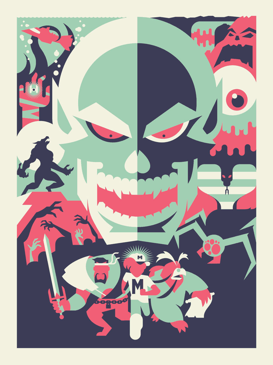
I was trying to keep it simple and straight-forward. Heroes in the front, baddies in the back, led by the main villain, Skull Master. It was a fun project, finished fairly quickly, posted on Dribbble and forgotten about... until nearly three years later.
Gallery1988 recently reached out to me to be a part of a Mattel art show, and I was happy to see that Mighty Max was one of the toy lines up for grabs! I remembered the piece I did a few years ago and was excited to dig it up again. Needless to say, I was kind of disappointed by it. I guess my style and taste had changed a bit in the past few years. I liked the concept and the composition, but the execution just felt boring and didn't reflect the scary, gross, fun aspects of the toys and shows.
So I redid it!
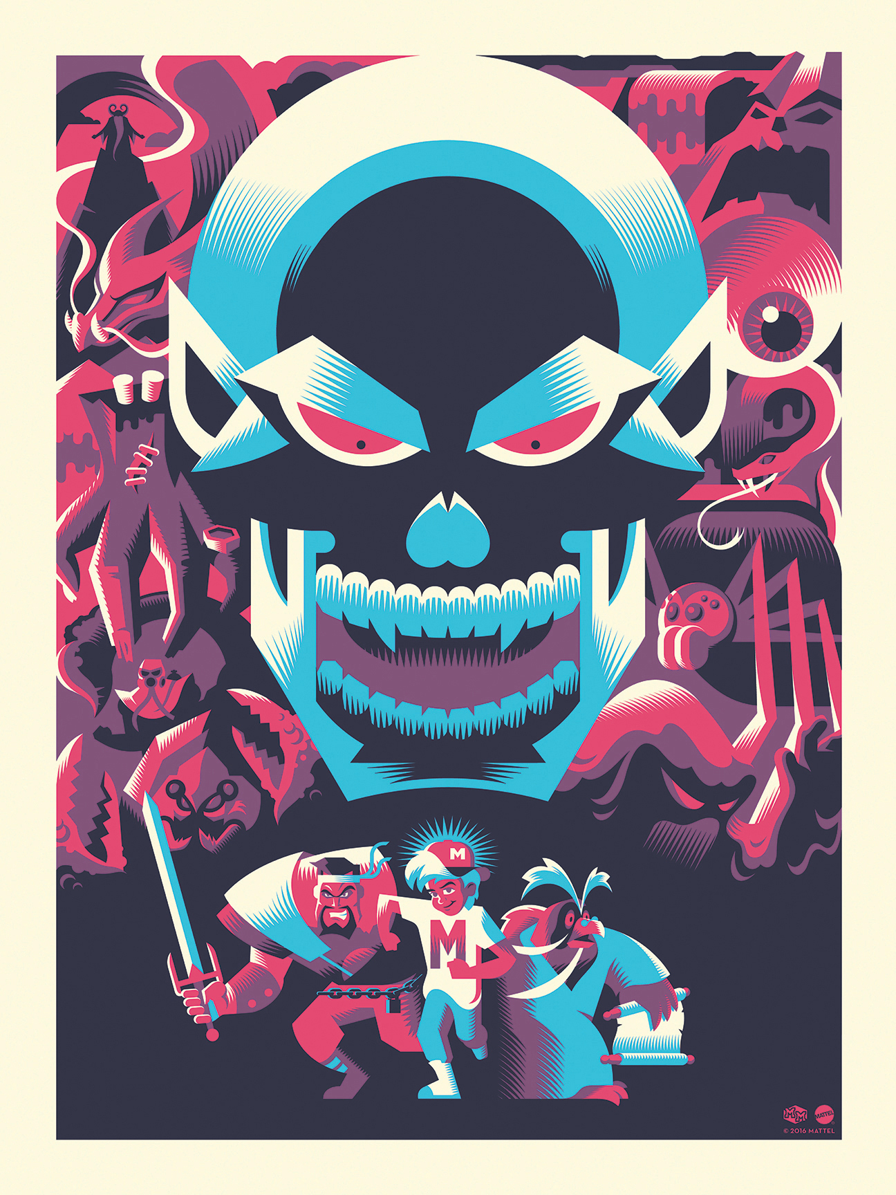
This new version took about four times as long as the old one, but it was worth it! I added more baddies, more detail, more dimension, and more features to our heroes. Here's a side-by-side comparison.
I had it screen printed with three colors, with the pink being transparent enough to create the purple color when it overlapped with the blue.
I had a ton of fun reworking this old design! It's nice to see first hand how I've worked to grow as an illustrator, always trying to pump out better and better work. This limited edition poster is for sale in the Bandito Shop.